
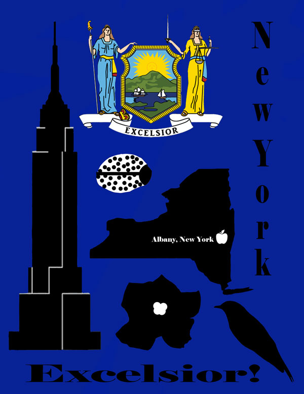
For my poster, the style I chose was Modernism. I thought of having American Industrial Design in the beginning, but it didn’t seem to work out. I had tried to make it look different than what I thought it would look like because my first design wasn’t going to be a fast one. The style impacted my design by having me understand what to put there. For all of my symbols, I had made New York’s state flower, bird, fruit, insect and building. New York just screamed Modernism. What I learned about my style was that it was more of a simple poster than making an American Industrial Design poster. An American Industrial Design poster is more detailed than modernism and had more of a 20th century look.
