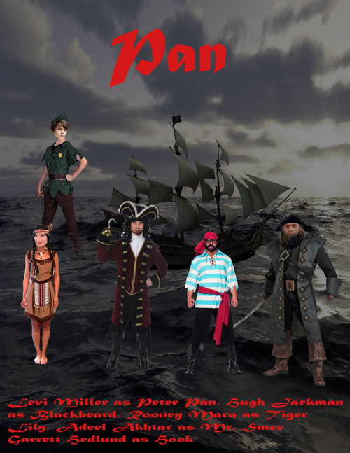
In my mission, I used the 6 Principles of Visual Hierarchy. One of the first things that I used was the size, or the boldness of letters or things. “Pan,” the title of the movie, was sized to be bigger so that people could read it first knowing that it was the movie title. Second of all, I also had the Z-patterns that apply to other sorts of pages. The Z-patterns are the characters. Next, I have space and texture. The space in this poster is the sky behind the ship and the ocean. I also have the typeface weight and pairing which is among a typeface’s most important attributes are weight – the width of the strokes that compose its letters. Then, I used the color and tint. The tint is the background and the color part is the characters. Finally, I used direction. The direction is horizontal for the letters and how the characters are standing. Its impact on the viewers are that they can see how much time and effort it puts into making a poster.
Grade: A

